
Your best salesperson never sleeps, never calls in sick, and never forgets to follow up. It works while you’re on a roof, under a sink, or asleep. That salesperson is your website — if you’ve built it right. Most service businesses haven’t. They have a brochure with a phone number, and they wonder why the phone doesn’t ring.
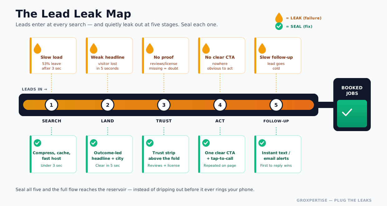
Here’s the uncomfortable truth: you probably don’t have a lead problem. You have a leak problem. Leads are finding you — searching “AC repair near me” at 11 p.m., tapping your listing, landing on your site — and then quietly leaking away because the page was slow, confusing, untrustworthy, or impossible to act on from a phone. Every one of those silent exits is a job that went to the competitor down the road.
This guide is the complete blueprint for plugging those leaks. We’ll cover every page, every system, and every technical decision that turns a website for service businesses from a digital business card into a lead-generating machine that works around the clock.
It’s long, it’s practical, and every section ends with something you can actually do. Let’s get into it.
1. Why Websites Still Matter (More Than Ever)
Every few years, someone declares the small-business website dead — killed by Google Business Profiles, social media, or now AI search. They’re wrong, and the data isn’t close.
Local search has become the front door to nearly every service business. Recent consumer research found that roughly 84% of people search for local businesses online, and the majority do it weekly or daily.
When a pipe bursts or an AC unit dies, the customer doesn’t open a phone book — they pull out their phone. And before they call anyone, they check.
Surveys consistently show that the vast majority of consumers review a company’s online presence before contacting it, and that accurate contact information ranks above price, proximity, and even reviews as a deciding factor.
One study found that 62% of consumers would avoid a business entirely if they found incorrect information online.
So why isn’t a Google Business Profile, a Facebook page, or a Yelp listing enough?
Because those platforms are rented land. You don’t control the layout, the call to action, the offers, or the data. They can change the rules, bury you under ads, or surface a competitor right next to your listing.
Your website is the only asset you own outright — the one place where you control the entire experience and capture the lead directly instead of handing it to a platform.
There’s also the trust math. When a homeowner is about to let a stranger into their house or spend $10,000 on a new roof, they’re nervous. Your website is where they decide whether you’re a real, competent, trustworthy business or a fly-by-night operation.
Google’s own data shows customers are 2.7x more likely to consider a business reputable when it has a complete, professional online presence, and 54% of consumers visit a business’s website after reading positive reviews — meaning your site is the conversion step after the review does its job.
And the AI shift makes this more important, not less. AI assistants and search overviews summarize and recommend businesses based on the structured, crawlable content on your site. If your site is thin, slow, or invisible, you don’t get recommended by the algorithm or the AI.
Bottom line: your website is the only owned asset where discovery, trust, and conversion all happen at once. It’s the central reservoir that every other channel — Google, Maps, social, ads, referrals — flows into. If the reservoir leaks, everything you pour into marketing leaks with it.
Do this now: Open your site on your phone, in incognito mode, the way a customer would. Time how long it takes to load, and try to find your phone number in under five seconds. Note where you hesitate. That hesitation is a leak.
Related: Curious how many leads you’re actually losing each month? Run the numbers with the Lead Leak Calculator for HVAC (or the calculator for your trade) before you read on — it’ll make the rest of this guide hit harder.
2. The Most Common Website Mistakes (And What They Cost You)
Before we build the right site, let’s name the leaks. After auditing hundreds of service-business websites, the same failures keep popping up. Here are the most expensive ones.
- No clear call-to-action. The visitor lands, reads, and… then what? If your most important page doesn’t make the next step obvious — call, book, get a quote — people leave. A website without a strong CTA is a store with no checkout counter.
- Buried or missing phone number. Service buyers are in a hurry. If your phone number isn’t tap-to-call and visible in the header on every page, you’re leaking your most ready-to-buy visitors — the ones who just want to talk to a human right now.
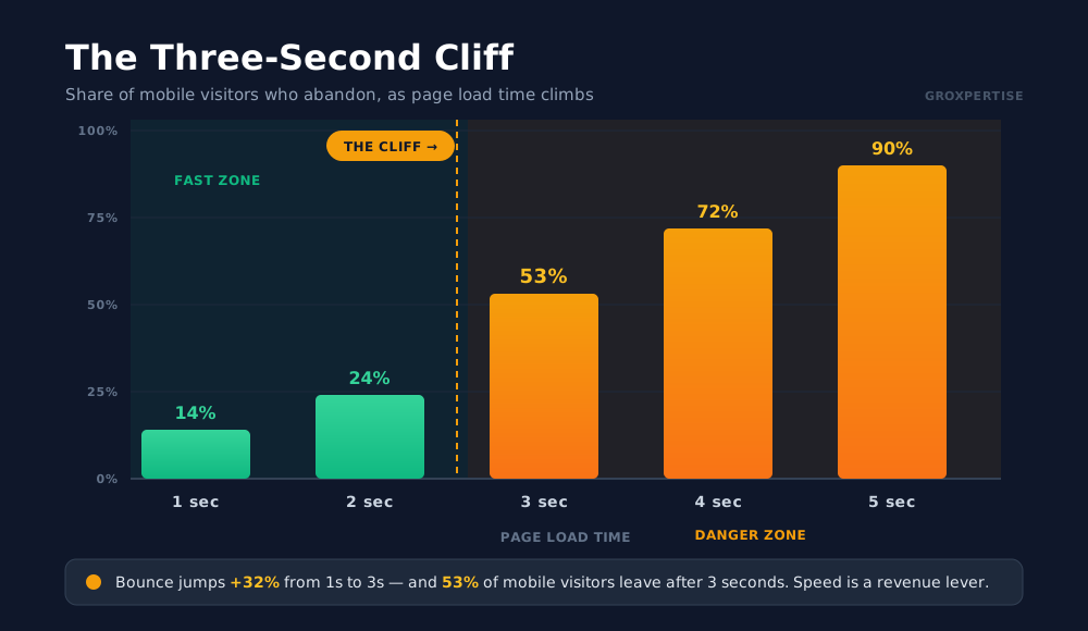
- Slow load times. This is the silent killer. 53% of mobile visitors abandon a page that takes longer than three seconds to load, and every additional second of delay drops conversions by roughly 7%. A slow site doesn’t just annoy people — it loses the customer before they ever see your offer.
- Not built for mobile. Most of your traffic is on a phone. If your site requires pinching, zooming, or rage-tapping a tiny button, you’re punishing the majority of your visitors.
- Talking about yourself instead of the customer. “We are a family-owned company with 25 years of experience” is about you. The customer cares about their leaking pipe, their freezing house, their peace of mind. Sites that lead with the customer’s problem convert far better than sites that lead with a company résumé.
- No trust signals. No reviews, no license number, no real photos, no guarantee. Stock photos of smiling models in hard hats. The visitor’s gut says, “I can’t tell if these people are legit,” and they bounce.
- Generic, thin content. One page that says “We do plumbing, heating, and electrical” can’t rank for any of them or convince a customer you specialize. Thin content is invisible to Google and unpersuasive to humans.
- Forms that ask for too much. A nine-field “Request a Quote” form is a wall. Every extra field you don’t need is a reason to give up.
- Dead ends and broken links. Pages that 404, forms that error out, chat widgets that go nowhere. Each one is a leak that a tradesperson would never tolerate in a real pipe.
Do this now: Pick the three mistakes above that you recognize on your own site. Those are your priority fixes. The rest of this guide tells you exactly how to fix each one.
3. The Anatomy of a High-Converting Service Website
A high-converting site isn’t a random collection of pages — it’s a system with a job to do at every stage. Think of it as a funnel built out of pages: attract the right visitor, build trust fast, and make taking action effortless.
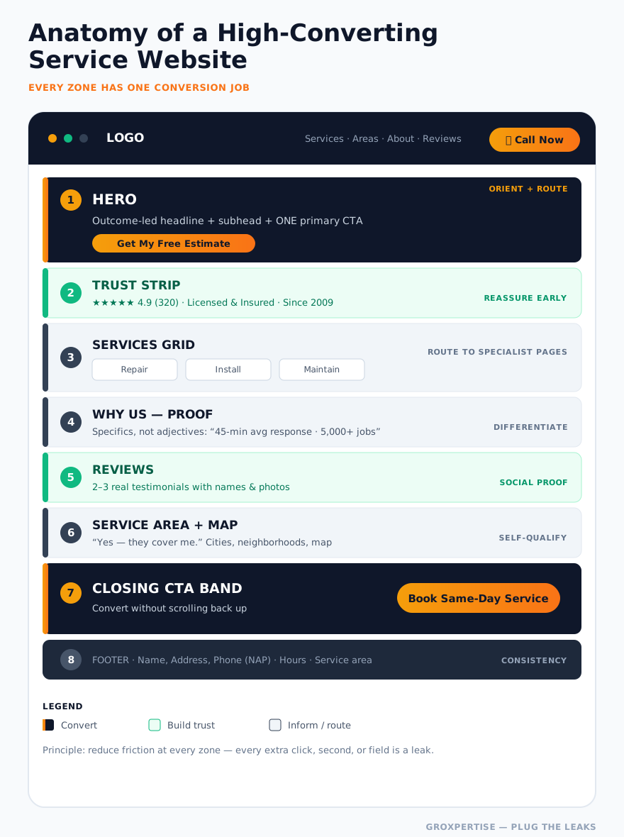
At a structural level, every effective service website needs these page types, each pulling its weight:
| Page | Its one job |
|---|---|
| Homepage | Orient the visitor in 5 seconds and route them to the right next step |
| Service pages | Rank for “[service] near me” and sell that specific service |
| Location pages | Win each city/neighborhood you serve |
| About page | Make you human and credible |
| Contact page | Remove every obstacle to reaching you |
| Trust assets | Reviews, guarantees, certifications, real photos |
| Conversion systems | Forms, booking, chat, click-to-call |
The pages attract and persuade; the conversion systems capture. A beautiful site with no capture system leaks. A great capture system on a site nobody trusts has nothing to capture. You need both — which is exactly why we cover both in this guide.
The organizing principle behind all of it: reduce friction at every step. Every click, every second of load time, every confusing word, every unnecessary form field is a small leak. Win by sealing them one at a time.
Do this now: List every page on your current site. Map each one to a job in the table above. Any page that doesn’t have a clear job is either a candidate for improvement or deletion.
4. Homepage Best Practices
Your homepage is the lobby. A visitor decides within seconds whether you’re worth their time, so the top of the page — what’s visible before anyone scrolls — has to do the heavy lifting.
The five-second test. A first-time visitor should instantly understand three things: what you do, who you do it for, and where. “Emergency Plumbing in Sacramento — Fixed Today or You Don’t Pay” answers all three. “Welcome to Our Website” answers none.
Anatomy of a homepage that converts:
- Header: Logo, navigation, and a tap-to-call phone number that stays visible (sticky) as people scroll. On mobile, a prominent “Call” button.
- Hero section: A benefit-driven headline (the customer’s outcome, not your company name), a one-line subhead that adds specificity, and one primary CTA button. Resist the urge to add five competing buttons.
- Trust strip: Immediately under the hero — star rating, number of reviews, “Licensed & Insured,” years in business, service-area badge. This is the “these people are legit” reassurance, delivered before the visitor even scrolls.
- Services overview: A simple grid linking to each service page. Don’t dump every detail here — route people to the right specialist page.
- Proof: A short “why homeowners choose us” section backed by specifics (response time, guarantee, real numbers), not adjectives.
- Reviews: Two or three real testimonials with names and, ideally, photos.
- Service area: A map or list of cities so visitors can self-confirm “yes, they cover me.”
- Closing CTA band: A final, full-width call to action so the visitor never has to scroll up to convert.
The headline formula that works for trades: [Outcome the customer wants] + [where] + [proof or risk-reversal]. For example, “Roof Leaks Stopped Fast Across Tampa — Free Inspection, No-Surprise Pricing.” It’s specific, local, and de-risked.
Do this now: Rewrite your hero headline so it leads with the customer’s outcome and your city. Remove every CTA from the hero except the single most important one.
5. Service Pages: Where the Money Is Made
If the homepage is the lobby, service pages are the showroom — and they’re the single biggest ranking and conversion opportunity most service businesses ignore. Here’s the rule: one dedicated page per core service. Not a paragraph on a combined “Services” page. A full, standalone page for AC repair, a separate one for AC installation, another for furnace repair, and so on.
Why? Because that’s how people search (“furnace repair near me,” not “HVAC services”), and it’s how Google decides what you’re an expert in. Industry research on local rankings consistently finds that having a dedicated page for each service is one of the strongest factors in showing up for that service. A combined page is a generalist; ten focused pages make you the specialist Google trusts and customers choose.
What a high-converting service page contains:
- A specific, keyword-aligned H1 — “Emergency Drain Cleaning in [City]” beats “Our Services.”
- The customer’s problem, in their words — describe the symptoms they’re experiencing (slow drains, gurgling, backups), so they think “yes, that’s me.”
- Your solution and process — what you do, step by step, so the unknown feels safe. Mystery creates hesitation; a clear process removes it.
- Proof specific to this service — before/after photos, a relevant review, “1,200+ drains cleared.”
- Pricing transparency — even a “starting at” range or “what affects the cost” section reduces the anxiety that makes people abandon.
- Risk reversal — guarantee, warranty, upfront pricing, satisfaction promise.
- A strong CTA — book now, call now, or get a quote, repeated at the top and bottom.
- An FAQ — answers common objections and helps you capture voice/AI search and “People Also Ask” results.
Internal linking matters here. Link related service pages to each other (AC repair → AC installation → maintenance plans) so visitors and Google can navigate the cluster. Link each service page to the relevant location pages as well.
Do this now: Identify your top three money-making services. If they share a single page, split them into three dedicated pages this week. Need a structured walkthrough of how these pages support local rankings? See the Ultimate Local SEO Guide for Service Businesses.
6. Location Pages: Win Every City You Serve
If you serve more than one city or neighborhood, location pages are how you compete in each one. A plumber based in Mesa who also serves Tempe, Chandler, and Gilbert shouldn’t expect the Mesa homepage to rank in Gilbert. Each market needs its own page.
Do them right — or don’t do them at all. The cardinal sin is the “doorway page”: ten near-identical pages with the city name swapped in. Google explicitly penalizes this, and customers see right through it. A genuine location page earns its place.
What makes a location page real and rankable:
- Locally specific content — mention real neighborhoods, landmarks, common housing stock (“the 1970s ranch homes in [neighborhood] tend to have aging galvanized pipe”), and local conditions (hard water, clay soil, hurricane season) that affect the work.
- Local proof — reviews from customers in that city, photos of jobs done there, “trusted by 400+ homeowners in [city].”
- The services you offer there, linked to your main service pages.
- Local NAP and service hours, plus a map of that service area.
- A market-specific CTA — “Serving [City] same-day. Call now.”
Done well, a network of location pages turns one business into a presence in a dozen local searches at once. Done lazily, it can turn into spam that drags your whole site down. The difference is whether each page says something true and useful about that specific place.
Do this now: List your top three revenue cities beyond your home base. Build one genuinely localized page for each — and resist the copy-paste shortcut. A 31-point readiness check is in the Local Lead Checklist for Plumbers(versions exist for each trade).
7. The About Page: Make It About Them, Then You
The About page is the most-clicked, least-optimized page on most service sites. Visitors go there for one reason: to decide if they can trust you — the actual humans who will show up at their door. So this is the place to be human.
What an About page should do:
- Lead with the customer. Open with why you exist for them — “We started this company because we were tired of seeing homeowners overcharged for simple repairs.” Connect your story to their problem before you tell your history.
- Show real faces. Photos of the actual owner and crew — not stock models. Real photos are one of the highest-trust signals you can add, because they prove you’re a real local team.
- Establish credibility with specifics. Years in business, number of jobs completed, licenses and certifications, awards, and community involvement.
- Tell a short origin story. People remember and trust stories far more than feature lists. Keep it human and brief.
- Reinforce the values that matter to a nervous buyer — honesty, cleanliness, on-time arrival, respect for the home.
- End with a CTA. Someone reading your About page is trust-shopping and close to deciding. Don’t leave them with nowhere to go.
The tone shift that works: less “award-winning premier provider of HVAC solutions,” more “We’re a family of three brothers who’ve been keeping [City] cool since 2009, and we treat your home like our mom’s.”
Do this now: Add at least one real photo of your owner or crew to your About page today, and rewrite the opening line to lead with why you help the customer rather than how long you’ve been in business.
8. The Contact Page: Remove Every Obstacle
The contact page is where intent turns into a lead — or leaks out at the last second. The goal is brutal simplicity: make reaching you effortless, and offer multiple ways to do it because different people prefer different channels.
Every contact page needs:
- A click-to-call phone number, large and tappable.
- A short contact form — name, phone, and “how can we help?” is often enough. Every field you remove lifts completion rates.
- Your email and service hours, including whether you offer emergency/after-hours service.
- A map and service-area confirmation so visitors know you cover them.
- Multiple contact options — phone, form, text, and chat — so the visitor picks their comfort zone.
- A response-time promise — “We reply within 30 minutes during business hours” turns a passive form into a confident next step.
The follow-up is the real leak. Here’s what almost no one optimizes: what happens after someone submits. Lead-response research is unambiguous — the business that responds first usually wins the job, and response speed drops off a cliff after the first few minutes.
If a form submission lands in an inbox nobody checks until tomorrow, you’ve captured the lead and then leaked it. Connect your forms to instant notifications (text and email) and, ideally, to an automatic acknowledgment to the customer so they know they’re not being ignored.
This is the single highest-leverage fix in this entire guide. A mediocre website with instant lead follow-up beats a beautiful website with slow follow-up every single time.
Do this now: Submit your own contact form right now. Time how long until you (realistically) would have responded. If it’s more than five minutes, set up instant text/email notifications today.
9. Trust-Building Elements: The Conversion Multiplier
For a service business, trust is the product. A homeowner is inviting a stranger into their home and paying for work they can’t fully evaluate. Every trust signal you add reduces that anxiety and lifts conversion across every page. Layer these everywhere:
- Reviews and ratings, displayed prominently — your aggregate star rating and recent testimonials. Pull in Google reviews so they’re live and credible. With consumer expectations rising, a visible **4.5+ star rating is increasingly the threshold** for getting the call at all.
- Licenses and certifications — license number, manufacturer certifications (NATE, factory-authorized dealer), bonding and insurance. These are non-negotiable proofs for trades.
- Guarantees and warranties — “100% satisfaction guarantee,” “2-year labor warranty,” “on-time or it’s free.” Risk reversal is one of the most powerful conversion tools you have.
- Real photos — your crew, your trucks, before/after work. Authenticity beats polish.
- Badges and affiliations — BBB, Angi, industry associations, “Veteran-owned,” “Family-owned since [year].”
- Specific numbers — “5,000+ jobs completed,” “Serving [City] since 2008,” “Average response time: 45 minutes.” Specifics are believable; adjectives aren’t.
- A real address and local phone number — proof you’re a genuine local business, not a lead-reseller from three states away.
The pattern that works: don’t make people hunt for trust — surface it before they have to ask. Put a trust strip near the top of every key page so reassurance arrives before doubt does.
Do this now: Add a trust strip (star rating + “Licensed & Insured” + years in business) directly beneath your homepage hero. It’s a 30-minute change that lifts conversions across the site.
10. Calls-to-Action: Tell People Exactly What to Do
A call to action is the moment you ask for the sale. Vague, weak, or missing CTAs are one of the most common — and most expensive — leaks on service websites.
Principles for CTAs that convert:
- One primary action per page. Decide the single most valuable thing a visitor can do (usually “Call” or “Book”), and make that the dominant button. Competing CTAs paralyze people.
- Use specific, action-led language. “Get My Free Estimate” beats “Submit.” “Call Now for Same-Day Service” beats “Contact Us.” Tell them what they get, not what they do.
- Make it visually unmissable. Your CTA button should be the most prominent element on the page — in your brand’s accent color, with high contrast and breathing room.
- Repeat it. Place a CTA in the header, after the hero, mid-page, and at the bottom. People decide at different moments; meet them wherever that happens.
- Reduce risk right next to it. “No obligation,” “Free quote,” “We reply in 30 minutes” — a tiny reassurance beside the button removes the last hesitation.
- Match the CTA to intent. Emergency pages should scream “Call Now.” Research-stage pages (“How much does a new roof cost?”) can offer a softer “Get a Free Estimate” or a downloadable guide.
The two-tier approach captures both types of visitor: a hard CTA (call/book) for the ready-to-buy, and a soft CTA (free guide, checklist, calculator) for the researcher who isn’t ready to talk yet but will trade an email for value. That soft offer is how you capture the 80% who aren’t ready to call today.
Do this now: Audit every page for its primary CTA. If a page doesn’t have one obvious next step, add one. If it has five competing ones, cut it down to the single most valuable one.
11. Mobile-First Design: Build for the Phone First
This isn’t optional anymore. The majority of web traffic is mobile — globally it’s around 60%, and for U.S. local searches, roughly half or more — and for “near me” emergency searches, it skews even higher, because people search while the problem is happening.
If your site works on desktop but frustrates the user on mobile, you’re failing the majority of your visitors at their moment of highest intent.
Mobile-first means designing for the phone first, then scaling up — not shrinking a desktop site down. In practice:
- Tap-to-call everywhere. The phone number in your header should be a tappable link on mobile. This is the #1 mobile action for service businesses.
- Thumb-friendly buttons. Large tap targets (at least ~44px), spaced so people don’t mis-tap. No tiny links crammed together.
- Readable without zooming. Body text around 16px minimum, high contrast, short paragraphs.
- Single-column layouts that stack cleanly. No side-by-side content that becomes unreadable on a narrow screen.
- Forms that are easy on a phone — minimal fields, the correct keyboard for each field (number pad for phone), and autofill enabled.
- Sticky CTA bar. A persistent “Call” / “Book” bar pinned to the bottom of the mobile screen keeps the primary action one thumb-tap away at all times.
- Fast on mobile data. Optimize for someone on a so-so cellular connection in their driveway, not your office fiber.
Google indexes the mobile version of your site first, so a poor mobile experience hurts your rankings and your conversions simultaneously. There’s no trade-off to manage here — mobile is the site.
Do this now: Add a sticky bottom CTA bar with a tap-to-call button on mobile. It’s one of the highest-ROI changes you can make.
12. Website Speed Optimization: The Three-Second Cliff
Speed isn’t a technical nicety — it’s a revenue lever and a leak you can measure in dollars. The data is stark: bounce probability jumps 32% as load time goes from one to three seconds, and 53% of mobile visitors leave a page that takes longer than three seconds.
Every additional second reduces conversions by roughly 7%. There’s a cliff at three seconds, and a lot of service-business sites fall right off it.
What actually slows service-business sites down — and how to fix each:
- Huge, unoptimized images. The #1 culprit. Compress every image, serve modern formats (WebP/AVIF), and never upload a 4MB phone photo straight into your site. Properly size images to their displayed dimensions.
- Cheap or overloaded hosting. Bargain shared hosting buckles under load. Quality managed hosting (especially for WordPress) pays for itself in conversions.
- Plugin and script bloat. Every plugin, tracking script, and third-party widget adds weight. Audit and remove what you don’t use.
- No caching or CDN. Caching serves pages instantly to repeat visitors; a CDN delivers your site from a server near the user. Both are usually quick wins.
- Bloated page builders and themes. Heavy drag-and-drop builders can generate slow, code-heavy pages. Choose a lightweight, well-coded theme.
- Render-blocking resources. Minify CSS/JS and defer non-critical scripts so the page paints fast.
Measure it. Run your site through Google PageSpeed Insights and aim for “good” Core Web Vitals — especially Largest Contentful Paint under 2.5 seconds. Test on mobile, on a throttled connection, because that’s where the cliff is.
Do this now: Run your homepage and top service page through PageSpeed Insights today. If your largest images are over ~200KB, compress them — that one fix alone often shaves a full second off load time.
13. UX Principles: Make It Effortless
User experience is the sum of all the small frictions and reliefs a visitor encounters. Great UX is invisible — the visitor never notices it because nothing gets in their way.
The guiding principle for service sites is clarity over cleverness. A confused visitor doesn’t call; they leave.
The UX rules that move the needle:
- Clear, simple navigation. A handful of obvious menu items: Services, Service Areas, About, Reviews, Contact. Don’t make people think about where to click.
- Visual hierarchy. The most important thing on each page should look the most important — biggest, boldest, highest. Guide the eye to the headline, then the proof, then the CTA.
- Consistency. Same header, same button style, same CTA placement on every page. Consistency builds subconscious trust and reduces cognitive load.
- Scannability. People skim. Use clear headings, short paragraphs, and bullet points so a skimmer still gets the message.
- Whitespace. Crowded pages feel stressful and cheap. Breathing room feels premium and calm — exactly the feeling you want a nervous buyer to have.
- Obvious interactive elements. Buttons should look like buttons. Links should look like links. Don’t make people guess what’s clickable.
- Accessibility. Sufficient color contrast, descriptive alt text, keyboard navigability. It’s the right thing to do, it widens your audience, and it helps SEO.
- No dead ends. Every page should offer a logical next step. Never strand a visitor.
A useful gut-check: hand your phone to someone unfamiliar with your business and ask them to “find out if this company does emergency service and book a call.” Watch silently. Every place they pause, squint, or backtrack is a friction point — and a leak.
Do this now: Do that hand-the-phone test with one person this week. Fix the first thing that trips them up.
14. SEO-Friendly Website Architecture
Architecture is how your site is organized — and a logical structure helps both Google and your visitors find what they need. Good architecture is the skeleton that makes everything else rankable.
The principles of a clean, crawlable structure:
- Logical hierarchy. Homepage → service categories → individual service pages → location pages. A visitor (and a crawler) should reach any important page within a few clicks of the homepage.
- Clean URLs. `yoursite.com/services/ac-repair/` tells Google and humans exactly what the page is. Avoid `/page?id=472`.
- Strategic internal linking. Link service pages to related services, to relevant location pages, and to supporting content (guides, FAQs). Internal links spread ranking authority and keep visitors moving deeper into your site instead of leaking out.
- One page per keyword theme. Don’t make two pages compete for “AC repair [city].” Each important search term gets one clear home.
- An XML sitemap and clean robots setup so search engines can find and index everything that matters.
- Schema markup. Structured data (LocalBusiness, Service, Review, FAQ schema) helps Google — and AI search — understand your business, your services, and your service area. This is increasingly how you show up in rich results and AI-generated recommendations.
- A logical content hub. A pillar guide linking out to specific service and location pages (and them linking back) creates a topic cluster that signals expertise.
Architecture and content work together: the structure makes your great service and location pages findable, and internal links pass authority where you want it.
Plenty of businesses have strong individual pages that never rank because nothing links to them and nothing tells Google they matter.
Do this now: Map your site as a simple tree. Any important page more than three clicks from the homepage should get internal links added to bring it closer to the surface.
For the full local-search playbook, work through the Ultimate Local SEO Guide for Service Businesses.
15. Lead Capture Systems: Turn Visitors Into Leads
Here’s where most of this guide pays off — or doesn’t. You can drive all the traffic in the world to a great-looking site, but if you don’t capture the visitor, you’ve just paid to send them away informed. Lead capture is the plumbing that catches the water before it hits the drain.
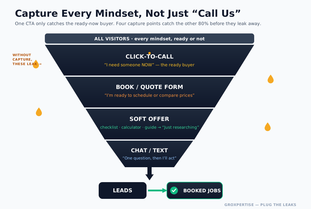
The principle: capture intent at every level, not just the bottom. Most sites only offer one way to convert — “call us” — which only catches the small slice of people ready to talk this second.
The other 80% are interested but not ready, and they leak away with no way to stay connected. Multi-tier capture fixes that:
- Click-to-call for the ready-now buyer.
- Booking and quote forms for those ready to schedule or compare.
- A “soft” lead magnet — a free guide, a maintenance checklist, a savings calculator, or a “what should this cost?” tool — that trades genuine value for an email. This is how you capture the researcher and stay in touch until they’re ready.
- Email follow-up so captured-but-not-ready leads don’t go cold. A simple automated sequence (“here’s your guide, here’s what to watch for, here’s our offer”) keeps you top of mind.
- Chat for the visitor with one quick question standing between them and a call.
The soft lead magnet deserves special attention because it’s the most underused tool on service sites. An interactive calculator that shows a homeowner what a repair or a leak is costing them, or a downloadable checklist, converts cold researchers into warm, emailed leads you can nurture.
(This is exactly the mechanism behind the HVAC Lead Leak Calculator and trade checklists — value first, capture second.)
Do this now: Add one soft lead magnet to your site — a checklist, a guide, or a calculator — gated behind a simple email capture. It’s how you stop leaking the 80% who aren’t ready to call yet.
16. Booking Forms: Reduce Friction to Zero
A booking or quote form is often the final step between a visitor and a lead — so it deserves obsessive attention. The rule is simple: ask for the minimum, and make every field effortless.
What makes a high-converting form:
- Fewest fields possible. Each field you add lowers completion. Name, phone, and “what do you need?” is often enough — collect the rest on the phone. Be ruthless: do you really need their address before they’ve even talked to you?
- Logical, single-column layout. One field per line, top to bottom. Multi-column forms confuse people on mobile.
- Smart inputs. A date picker for scheduling, dropdowns for service type, the correct mobile keyboard for each field, and autofill enabled.
- Clear, benefit-driven button copy. “Get My Free Quote,” not “Submit.” Tell them what happens next.
- Reassurance near the button. “No obligation. We’ll call within 30 minutes.” A tiny line of copy lifts completion by a noticeable amount.
- Real-time online scheduling, where it fits. For services that suit it (tune-ups, inspections, estimates), letting customers pick a slot and book themselves — 24/7, no phone tag — removes the biggest friction of all and captures the after-hours buyer.
- Instant confirmation and notification. The customer gets an immediate “we got it”; you get an instant text/email. Back to the response-speed point: the magic isn’t the form, it’s how fast you act on it.
A multi-step form can actually out-convert a single long form, because answering one easy question first (“What service do you need?”) creates momentum that carries people through the rest. Test it.
Do this now: Count the fields on your main form. If it’s more than four, cut it down. Then make the submit button say what the customer gets.
17. Chat Widgets: Catch the Hesitant Visitor
A chat widget catches a specific, valuable visitor: the one with a single question standing between them and contacting you. “Do you service my area?” “Do you offer financing?” “Can you come today?” Without chat, that person often just… leaves. With it, you turn a silent exit into a conversation.
How to use chat without creating new leaks:
- Make sure someone (or something) actually answers. A chat widget that goes unanswered is worse than none — it promises help and breaks the promise. If you can’t staff live chat, use an AI/automated chat or a chatbot that can answer common questions and capture contact info.
- Capture the lead even when you’re not available. After hours, the widget should gather name and number and promise a callback, turning chat into a lead-capture form with a friendlier face.
- Offer text/SMS chat. Many homeowners prefer texting. “Text us” can outperform a traditional chat box for trades.
- Seed it with the questions people actually ask — service area, pricing, availability, emergency service — so answers are instant.
- Don’t let it slow your site or smother the screen. A heavy chat script can hurt load speed, and an aggressive pop-up that covers the CTA on mobile creates friction. Keep it light and unobtrusive.
Chat works best as a supplement to clear calls to action, not a replacement. Make calling and booking obvious first; let chat catch the stragglers who need one more answer.
Do this now: If you add chat, test that messages reach you instantly and that the after-hours flow captures a name and number. An ignored chat is a leak with a friendly face.
18. Website Security: Protect Trust and Rankings
Security isn’t glamorous, but a hacked or insecure site can erase your credibility and rankings overnight — and customers won’t hand over their information to a site that looks unsafe.
The security baseline every service site needs:
- SSL/HTTPS. Non-negotiable. Browsers flag non-HTTPS sites as “Not Secure,” which instantly spooks visitors, and Google favors secure sites. Most quality hosts include a free SSL certificate — make sure yours is active.
- Keep everything updated. On WordPress, especially, outdated core, themes, and plugins are the #1 way sites get hacked. Update promptly, and remove plugins you don’t use.
- Strong logins. Strong, unique passwords and two-factor authentication on your admin accounts. Limit who has admin access.
- A security plugin or firewall (and managed hosting that includes protection) to block malicious traffic and brute-force attempts.
- Regular backups. Automatic, off-site backups mean that if the worst happens, you can restore in minutes instead of losing everything. This is your insurance policy.
- Spam protection on forms. Without it, your contact forms become a flood of junk that buries real leads — itself a kind of leak.
The customer-facing payoff is simple: a secure site (padlock in the address bar, fast and stable, no scary warnings) signals professionalism and protects the trust you’ve worked to build.
Do this now: Confirm your site loads with `https://` and a padlock. If it doesn’t, contact your host about a free SSL certificate today — this is urgent.
19. Website Maintenance: Keep the Machine Running
A website isn’t a “set it and forget it” asset. It’s a living tool that needs upkeep to keep converting — neglect creates slow leaks that widen over time. The good news: a small, consistent routine prevents nearly every major problem.
A simple maintenance rhythm:
Weekly / ongoing:
- Respond to leads instantly (the most important “maintenance” of all).
- Monitor form submissions and notifications to confirm nothing is broken.
- Keep reviews fresh and respond to new ones.
Monthly:
- Apply software, theme, and plugin updates (after backing up).
- Check for broken links and fix or redirect them.
- Verify forms, booking, and chat all still work end-to-end. (Test them yourself — broken forms are the most expensive silent leak there is.)
- Review page speed and Core Web Vitals.
- Add fresh content — a new service page, a blog post, updated photos, recent reviews. Active sites rank better.
Quarterly / as needed:
- Review analytics: which pages convert, where visitors drop off, what’s leaking.
- Update seasonal offers and service pages.
- Refresh proof — new before/after photos, updated job counts, recent testimonials.
The metric that matters: don’t just watch traffic — watch conversions.
A site that gets 1,000 visits and 10 leads has a leak; a site that gets 500 visits and 25 leads doesn’t. Maintenance is about finding and sealing those leaks before they cost you a season’s worth of jobs.
Do this now: Put a recurring monthly 30-minute “website check” on your calendar. Test your own forms first, every time.
20. When (and How) to Redesign — Redesign Considerations
Sometimes the leaks are too many and too deep to patch, and a redesign is the right move. But a redesign is also where businesses create new leaks — losing rankings, traffic, and conversions in the process.
Here’s how to know when it’s time, and how to do it without setting yourself back.
Signs you genuinely need a redesign:
- The site isn’t mobile-friendly or fails Core Web Vitals and cannot be fixed in place.
- It looks dated enough that it actively costs you trust (visitors judge fast).
- It’s slow at a fundamental, structural level; no plugin will fix it.
- It can’t capture leads — no decent forms, booking, or CTAs — and the platform won’t support adding them.
- It’s painful to update, so it never gets updated.
- Conversion rates are poor despite solid traffic — the clearest signal of all.
Signs you don’t need a full redesign (and should optimize instead): the bones are fine, but the homepage headline is weak, the CTAs are buried, or follow-up is slow.
Many “we need a new website” problems are actually “we need to fix five things” problems — far cheaper and faster. Always rule out targeted optimization before committing to a rebuild.
How to redesign without leaking what’s working:
- Benchmark first. Record current rankings, traffic, top pages, and conversion rates before you touch anything. You can’t protect what you didn’t measure.
- Keep your URLs — or redirect them. Changing URLs without 301 redirects is the classic way to torch your hard-won SEO. Map old URLs to new ones and redirect every single one.
- Preserve your best-performing content. Don’t delete pages that rank and convert; carry them forward and improve them.
- Design mobile-first and conversion-first from the start — bake in everything in this guide rather than bolting it on later.
- Don’t lose your lead capture during the transition. Forms, tracking, and notifications must work on day one of launch.
- Test thoroughly before launch — every form, link, page, and the mobile experience.
- Monitor closely after launch. Watch rankings, traffic, and conversions for the first few weeks and fix any drop fast.
A redesign should seal leaks, not open new ones. Approach it as a conversion upgrade with SEO carefully protected, and it becomes one of the highest-return investments you can make.
Do this now: Before any redesign, document your current top pages, rankings, and conversion rate. If your real problem is a weak headline and slow follow-up, fix those first — you may not need the rebuild at all.
21. Before & After: Four Service Sites, Rebuilt to Convert
Principles are useful, but transformations are convincing. Below are four representative “before and after” rebuilds — one for each priority trade.
These are illustrative composites built from the patterns we see again and again, not specific client claims, but every change is one you can make this month. Notice that none of them are about making the site prettier. Each one seals a specific leak.
HVAC — From Brochure to Emergency Dispatch
Before: A clean-looking but generic site. The headline read “Welcome to Our Company.” The phone number lived in the footer. No tap-to-call on mobile. The “Contact” form had nine fields and asked for the customer’s full address before they’d even decided to call. When someone’s AC died at 9 p.m. in July, they bounced and called the next result.
After: The headline became outcome-led — “AC Out? We’ll Have It Cool Again Today — Same-Day Service in [City].” A sticky tap-to-call bar rides the top of every mobile screen.
A red “Emergency? Call Now” band sits above the fold, and a financing badge (“$0 down on new systems”) answers the silent objection on a $5,000 ticket. The nine-field form shrank to three: name, phone, “what’s going on.”
The leak it sealed: the gap between emergency intent and instant action. HVAC is won in the first 60 seconds of panic — the rebuild made the call to the path of least resistance.
Plumbing — From “Are You Even Open?” to Booked in 30 Seconds
Before: The site never said whether the company answered after hours. A burst pipe at midnight met a static page with business hours (8–5) and a contact form promising a reply “within 1–2 business days.” For an emergency trade, that’s a leak the size of the pipe that just burst.
After: A 24/7 availability banner sits at the very top: “Burst pipe? Backed-up drain? We answer the phone 24/7.” Tap-to-call is the primary CTA; an online booking widget is the secondary one for non-emergencies (“Schedule a drain cleaning — pick your window”). The trust strip shows the license number, “insured,” and a live review score. The form consists of two fields and a dropdown for the problem.
The leak it sealed: availability doubt. On a $1,500 average ticket where most calls are urgent, simply proving you’ll pick up — instantly and visibly — recaptures the after-hours jobs that were leaking to competitors.
Roofing — From Anonymous Quote Form to Trusted Investment
Before: A high-ticket trade ($10,000+ average job) treated like a low-ticket one. The site had stock photos, no real project gallery, no financing, no proof of licensing or insurance, and a single “Request a Quote” button that felt like volunteering for a sales pitch. On a five-figure decision, that’s not enough trust to act.
After: A real before/after project gallery (actual roofs, actual neighborhoods) anchors the homepage. Badges for licensing, insurance, and manufacturer certifications sit in the trust strip. Financing is front and center (“Roofs from $99/month”).
The primary CTA changed from “Request a Quote” to a lower-commitment “Get a Free Roof Inspection” — a soft entry that fits the longer roofing decision cycle. Reviews are surfaced beside the CTA, where doubt peaks.
The leak it sealed: insufficient trust for the ticket size. Roofing buyers research for weeks; the rebuilt site provides proof and a low-friction first step, rather than demanding a high-commitment quote request on visit one.
Electrical — From Vague to Licensed, Safe, and Specific
Before: A one-page site listing “electrical services” with no specifics, no license number, and no sense of which jobs the company actually wanted. A homeowner worried about an overheating panel had no way to know whether this was the right call—and safety-sensitive buyers don’t gamble.
After: Service-specific pages (panel upgrades, EV charger installs, troubleshooting, rewiring) each speak to a distinct job and intent. “Licensed & Insured — License #[XXXX]” appears in the header, not buried.
Safety framing leads the copy (“Flickering lights or a warm panel? Don’t wait — those are warning signs”). A clear quote form for planned work sits alongside tap-to-call for urgent issues. EV charger installs — a high-growth, high-intent service — get their own dedicated page.
The leak it sealed: credibility and relevance. On a trust-and-safety trade, proving you’re licensed, specific, and the right fit for this job converts the cautious researcher from the old vague page lost.
The pattern across all four: the “after” never wins on looks. It wins by matching the page to the customer’s mindset, proving trust before doubt sets in, and making the next step a single tap. That’s the whole game.
Do this now: Write your own “before” honestly — open your homepage and name the single biggest leak a panicked customer would hit in the first ten seconds. That’s your first “after.”
22. Design Recommendations That Sell
Design for a service business isn’t decoration — it’s a conversion tool. Every visual choice either builds trust and guides the eye toward the next action or adds friction. Here’s what actually moves the needle, kept practical.
Lead with clarity, not cleverness. Visitors decide in seconds whether they’re in the right place. The hero needs three things instantly legible: what you do, where you do it, and how to act. Clever taglines that hide the offer are a leak. “Same-Day AC Repair in [City]” beats “Comfort, Reimagined” every time.
Use a deliberate, limited color system. Pick a trustworthy base (deep navy, charcoal, or a clean dark tone read as professional and stable), one accent color reserved exclusively for primary CTAs so the eye always knows where to click, and a success/trust color (green) for checkmarks, badges, and confirmation.
When your “call now” button is the only thing in bright orange on the page, clicks rise — contrast is conversion. Don’t dilute it by using the CTA color for decoration.
Typography: legible beats fancy. Use a strong, modern sans-serif for headlines and a highly readable body font at 16–18px minimum on mobile. Generous line spacing. Short paragraphs. A homeowner reading on a phone in a stressful moment should never have to squint or pinch-zoom.
Real photos beat stock — by a lot. Photos of your actual trucks, team, and completed jobs build more trust than any polished stock image.
For roofing, especially, real before/after project shots are among the highest-converting assets on the site. If you must use stock early on, choose authentic, unposed images and replace them with real ones as soon as you can.
Design the trust strip as a fixed pattern. Reviews/star rating, years in business, license and insurance, and service area belong in a consistent, scannable band near the top. Treat it as a component that appears on every key page, not a one-off.
Whitespace is a feature. Cramped, cluttered pages read as amateur and overwhelm the visitor. Breathing room around your headline, CTA, and trust elements makes them more powerful, and the whole site feels more credible.
Make the CTA impossible to miss. Buttons should be large, high-contrast, and use action language (“Call Now,” “Get My Free Quote,” “Book Service”). On mobile, the primary CTA should be reachable with a thumb without scrolling, and a sticky tap-to-call bar should follow the visitor down the page.
Direct the eye on purpose. Use size, contrast, and position to create a clear visual hierarchy: headline → trust → CTA. When everything is competing for attention equally, nothing gets attention. Each screen should have one obvious “most important thing.”
Consistency signals competence. Same fonts, colors, button styles, and spacing across every page. Inconsistency reads, subconsciously, as “this business is disorganized” — and people don’t hand disorganized businesses their house keys.
Do this now: Audit your buttons. If your primary CTA color appears anywhere, it isn’t a primary action; change those other elements to a neutral tone. Reserve the accent color for clicks only — you’ll see the difference in your tap-through rate.
23. The Conversion Optimization Playbook
Traffic is potential; conversion is revenue. You can double your leads without a single extra visitor by sealing the leaks between landing and booking.
These are the highest-leverage moves, roughly in order of impact.
- Speed-to-lead is the whole ballgame. The single biggest conversion lever isn’t on the page — it’s what happens after the form submits.
Responding to a new lead within five minutes rather than 30 can multiply your conversion rate several times over. Wire every form and call to instant text/email alerts and an auto-reply so no lead ever sits. (This is the leak that quietly costs the most.)
- One primary CTA per page. Competing calls-to-action split attention and lower conversion. Decide the single most important action for each page and make it the unmistakable star; demote everything else to secondary.
- Reduce form friction ruthlessly. Every field you remove raises completion. Ask only for what you need to make contact — usually name, phone, and a one-line problem description. Address, preferred times, and details can come on the call.
- Put proof where doubt peaks. Place reviews, ratings, and trust badges right next to your CTAs and forms — the exact moment hesitation kicks in. A five-star snippet next to the “Get a Quote” button measurably increases submissions.
- Add honest urgency. “Same-day slots filling fast,” “Booking [Month] now,” or a visible response-time promise nudges the ready-but-procrastinating visitor to act. Keep it true — fake countdown timers erode the trust you’re building.
- Offer a low-commitment first step. Not everyone is ready to buy. A free inspection, an instant quote, or a soft download (checklist, calculator) captures the researcher who isn’t ready to call — especially in longer-cycle trades like roofing. Capture them now, follow up, and you own the lead when they’re ready.
- Make the phone number tappable and everywhere. On mobile, every visible phone number should dial on tap. Header, hero, sticky bar, footer. For emergency trades, this single change recaptures a surprising share of lost calls.
- Test one thing at a time. Headlines, button text, button color, form length, and CTA placement are the highest-yield tests. Change one variable, watch the result, keep the winner. Small, compounding wins beat one big guess.
- Match the message to the source. A visitor from a “24-hour emergency plumber” ad should land on a page that screams 24-hour emergency — not a generic homepage. Message match between ad/search intent and the landing page is one of the most overlooked conversion multipliers.
- Track what matters, then act on it. Set up call tracking and form-conversion tracking so you know which pages and sources actually produce booked jobs. You can’t optimize a leak you can’t see. Review monthly and reinvest in what converts.
Do this now: Pick the one move on this list you haven’t done — almost always #1, instant lead follow-up — and implement it this week. It’s the cheapest, fastest, highest-return change in the entire guide.
24. Your Complete Website Checklist
Use this as a launch checklist for a new site or an audit checklist for your current one. Work top to bottom; every unchecked box is a potential leak.
(Want this pre-built and trade-specific? Grab the downloadable Local Lead Checklist for your trade at the end of this guide.)
Foundation & Speed
- Loads in under 3 seconds on mobile (test on a real phone, on data, not just wifi)
- Passes Google’s Core Web Vitals
- Images compressed and properly sized; no oversized files
- HTTPS/SSL active — the padlock shows, no “Not Secure” warning
- Hosting is fast and reliable; caching enabled
Mobile Experience
- Fully responsive — no pinching, zooming, or sideways scrolling
- Tap-to-call on every visible phone number
- Sticky tap-to-call or CTA bar follows the visitor
- Buttons and tap targets are thumb-sized and well-spaced
- Forms are short and easy to complete one-handed
Homepage
- Headline states what you do + where, in plain language, above the fold
- Primary CTA visible without scrolling
- Trust strip near the top (reviews, years, license, insured, service area)
- Services overview with links to individual service pages
- Real photos of your team, trucks, and work
Service & Location Pages
- A dedicated page for each core service (not one lumped “Services” page)
- A dedicated, genuinely useful page for each city/area you serve
- Each page has its own clear CTA and trust signals
- Content speaks to the specific job and customer intent
Trust Elements
- Reviews/testimonials displayed prominently (ideally pulled live)
- License number and insurance status visible
- Certifications, awards, and guarantees shown
- Real team/owner photos and a genuine story on the About page
- Consistent, correct NAP (name, address, phone) everywhere
CTAs & Lead Capture
- One clear primary CTA per page
- Multiple capture paths: call, form, book online, chat
- Forms ask only for essential fields
- Online booking/scheduling available for non-emergency jobs
- A soft offer (quote, inspection, checklist) for not-yet-ready visitors
- Instant follow-up wired up — new leads trigger immediate text/email alerts
SEO Architecture
- Logical structure: Home → Services → individual services; Home → service areas
- Unique title tag and meta description on every page
- One clear H1 per page; descriptive headings
- Clean, readable URLs
- Internal links connecting related pages
- Local Business / Service schema markup in place
- Connected to Google Business Profile
Security & Maintenance
- Software, themes, and plugins kept updated
- Regular automated backups running
- Security/firewall protection active
- All forms, links, and the booking flow are tested and working
- Analytics and call tracking installed and monitored monthly
Pre-Launch (for new sites or redesigns)
- Old URLs 301-redirected to new ones
- Rankings, traffic, and conversion benchmarks recorded beforehand
- Lead capture and notifications confirmed working on day one
- Every page, form, and CTA tested on desktop and mobile
Do this now: Print this section or open it on a second screen and walk your live site against it right now. Count your unchecked boxes — that number is a rough map of how many places your site is leaking leads today.
Conclusion: Seal the Leaks, Capture the Jobs
Your website doesn’t have to be the prettiest one in your market. It has to be the one that converts — the one that loads fast, builds trust in seconds, works flawlessly on a phone, makes the next step obvious, and captures the lead before it leaks away. Do that, and you’ve built a salesperson that works 24 hours a day, 7 days a week, in every city you serve.
You don’t have to fix everything at once. Start with the leaks that cost the most:
- Speed — get under the three-second cliff.
- Mobile — add tap-to-call and a sticky CTA.
- A clear primary CTA on every page.
- Trust signals surfaced before doubt sets in.
- Instant lead follow-up — the single highest-leverage fix of all.
Seal those five, and you’ll feel the difference in your phone’s call log before you’ve touched anything else.
Want to know exactly how many leads your current site is leaking — and where? Run the numbers for your trade in 60 seconds:
- HVAC Lead Leak Calculator
- Plumbing Lead Leak Calculator
- Roofing Lead Leak Calculator
- Electrical Lead Leak Calculator
Then grab the matching Local Lead Checklist for your trade and work through the 31 points that turn a website into a lead machine.